Report Redesign to Improve Value Perception
D2C
Information Design
Visual Design
User Experience
Goal
Make the report more useful for patients and doctors while also highlighting the brands key differentiations
My role
Visual Designer
I redesigned the report end to end. I aligned with the stake holders and conducted formative users tests to create impactful designs.
Client
Nura by Fujifilm & Dr. Kutty’s
NURA is India’s first AI-powered preventive health screening service focused on early detection of cancer and lifestyle diseases. By combining advanced imaging, AI diagnostics, and a guided patient experience, NURA delivers fast, comprehensive full-body health assessments.
Context
1
Reports Causing Panic
Nura uses a grading system to simplify communication of the test results. This has caused a lot of panic amongst its customers due to misinterpretation.
2
Retention Problems
People see the reports as just a colourful version of regular diagnostic report which leads to the service feeling unnecessarily expensive.
3
Lack of Doctor Recommendation
The report is only designed for the patients and not their doctors. They face trouble in finding the information they need. The non-standard, oversimplified communication feels unprofessional to them.
Strategy
1
People need to understand Nura's grading system better
2
The report should be set up in such a way that key differentiators is highlighted
3
A separate clinician facing section is needed with standard medical communication format
Solution
Touchpoints Designed
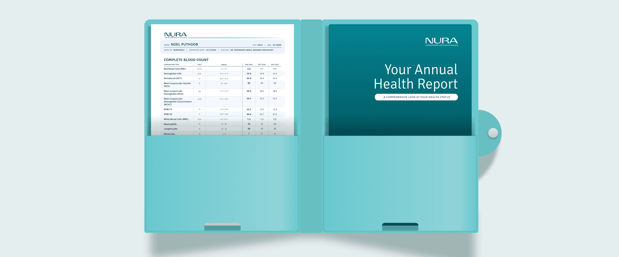
Patient Facing Report
Clinician Facing Report
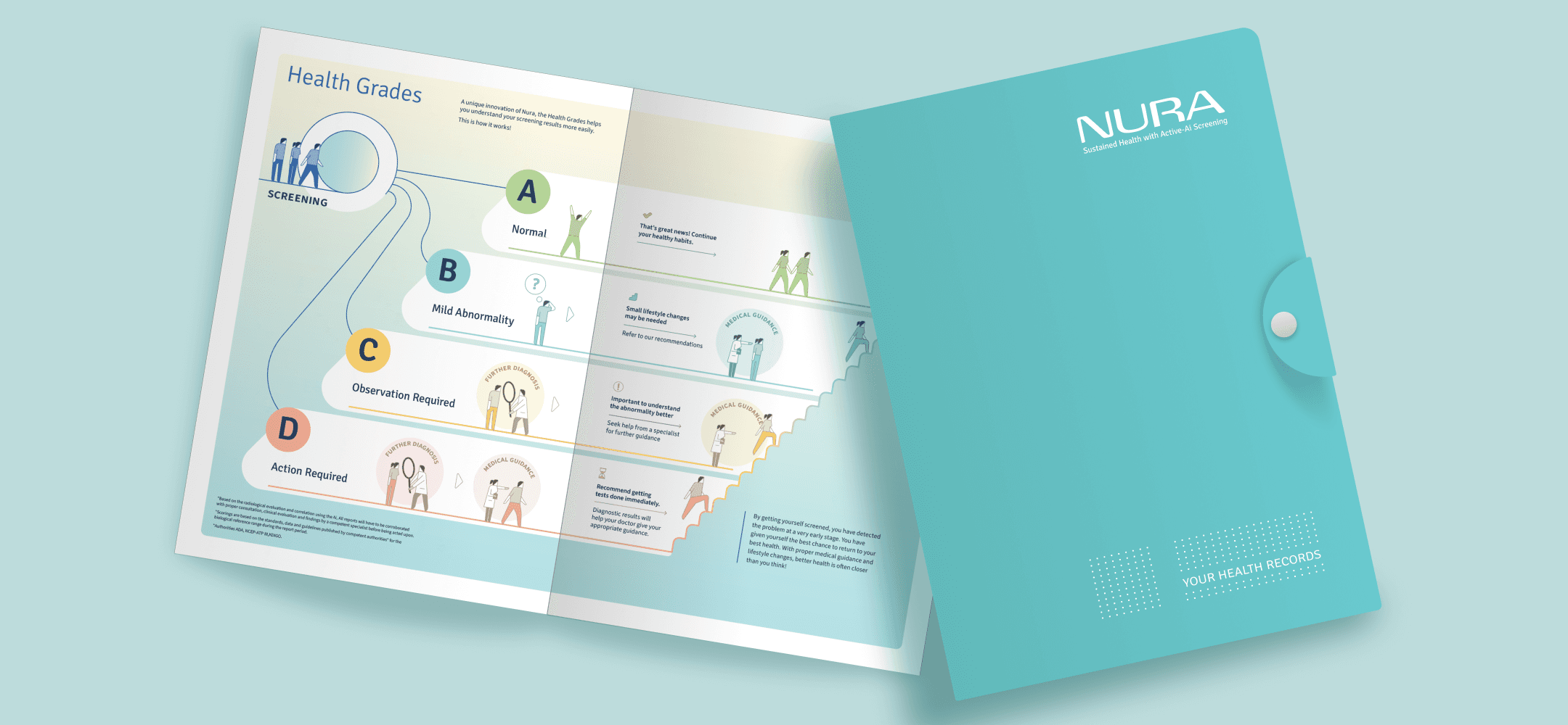
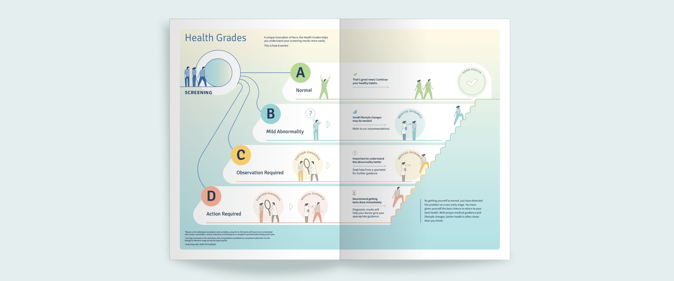
Better Explanation for Health Grades
Nura wants its customers to take control of their journey to better health. This is the main reason for a simplified grading system.
Infographics to not just inform, but also reassure
We designed an infographic that communicates in a relatable manner. Characters and a soothing colour palette was used to ensure people stop and look at the infographic and understand Nura's unique method.
Reiterating the information on all report pages
The reader need not memorise what each grade means. The meaning of the grade is doubled down at the end of each report.
Highlighting the Differentiation
The report is the only physical touchpoint that the users take with them back home which makes it an important branding touchpoint.
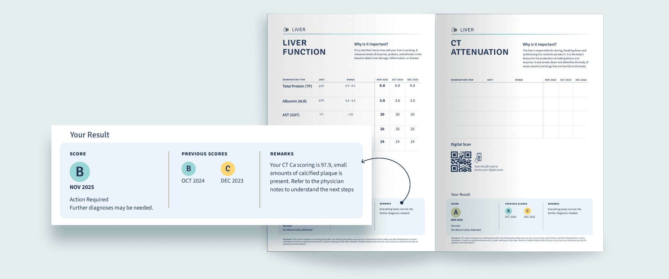
Comprehensive nature of the report
The information in the report is organised in an organ based system which reiterates to the viwer that all parts of the body has been covered in Nura's screening.

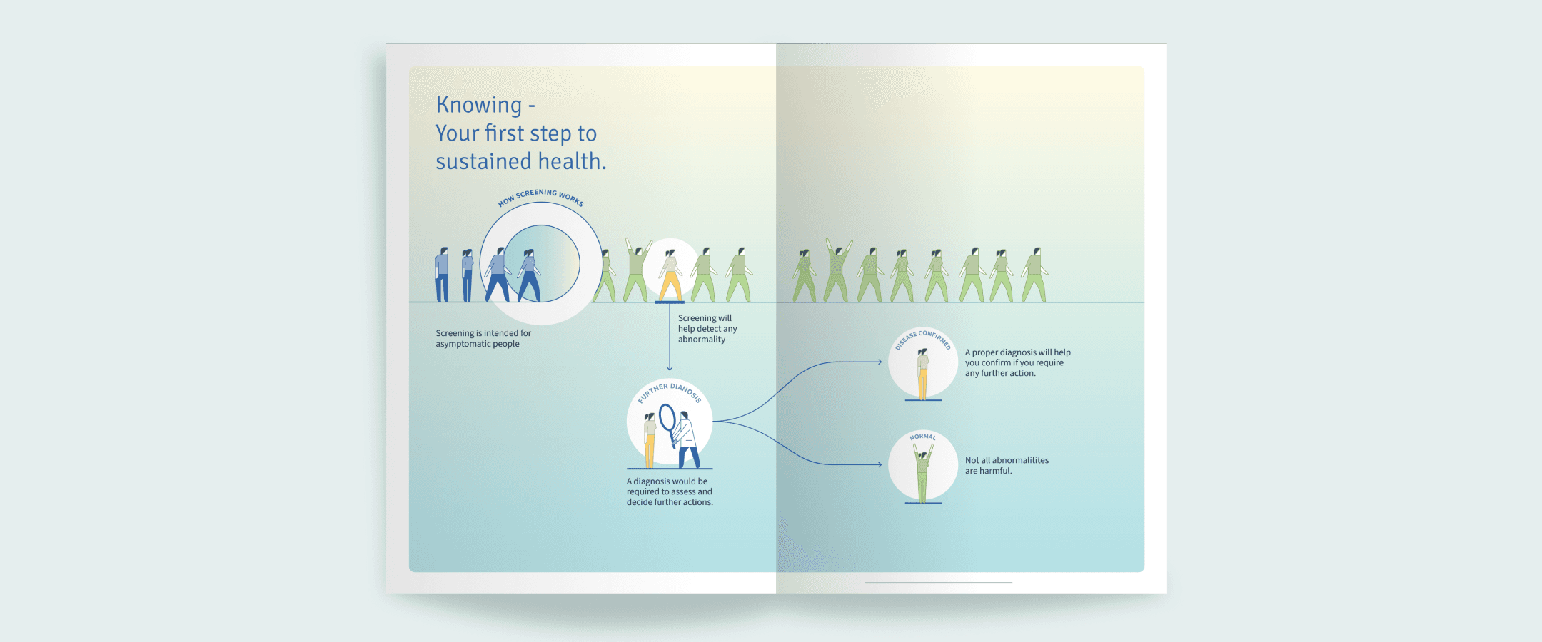
Screening vs Diagnosis
We designed an infographic to explain how screening works. Viewers also understand screening is different from diagnosis. This understanding is crucial for Nura's success.
Efficient Report for Clinicians
Doctors prefer the report to be straightforward and something they are used to. We decided it's best to not reinvent the wheel and stick to standard practice
Separate section for clinicians
We expanded the report from a booklet to a folder which has both, patient facing booklet and clinician facing report sheets. This made it easier for doctors to access relevant information quickly.
Impact
Piloting the new design
The new design is being piloted at Nura centers in Bengaluru and Gurgaon. 25% of the visitors are being given the new reports to validate progress. The early signs are very promising.
39%
Reduction in customer care enquiries regarding report confusions
7.3%
Increase in user satisfaction ratings
8%
Increase in word of mouth referrals